*Tools Used: Adobe Illustrator, and InDesign
Logo Design
Logo Development & Inspiration
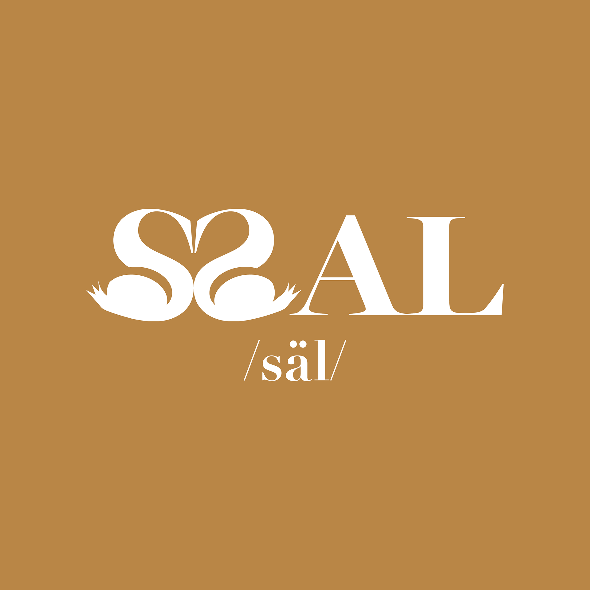
In crafting this logo, I experimented with multiple iterations to design a unique representation of the letter "S," styled as facing Mandarin ducks. Inspired by the symbolism of the Mandarin duck, which represents the ideal union that newlyweds strive to achieve, the design mirrors the bird’s significance. This design represents a deep cultural reverence and transforms a traditional symbol into a modern visual identity.
Menu Design (5 X 15in)
#1 Design Highlight
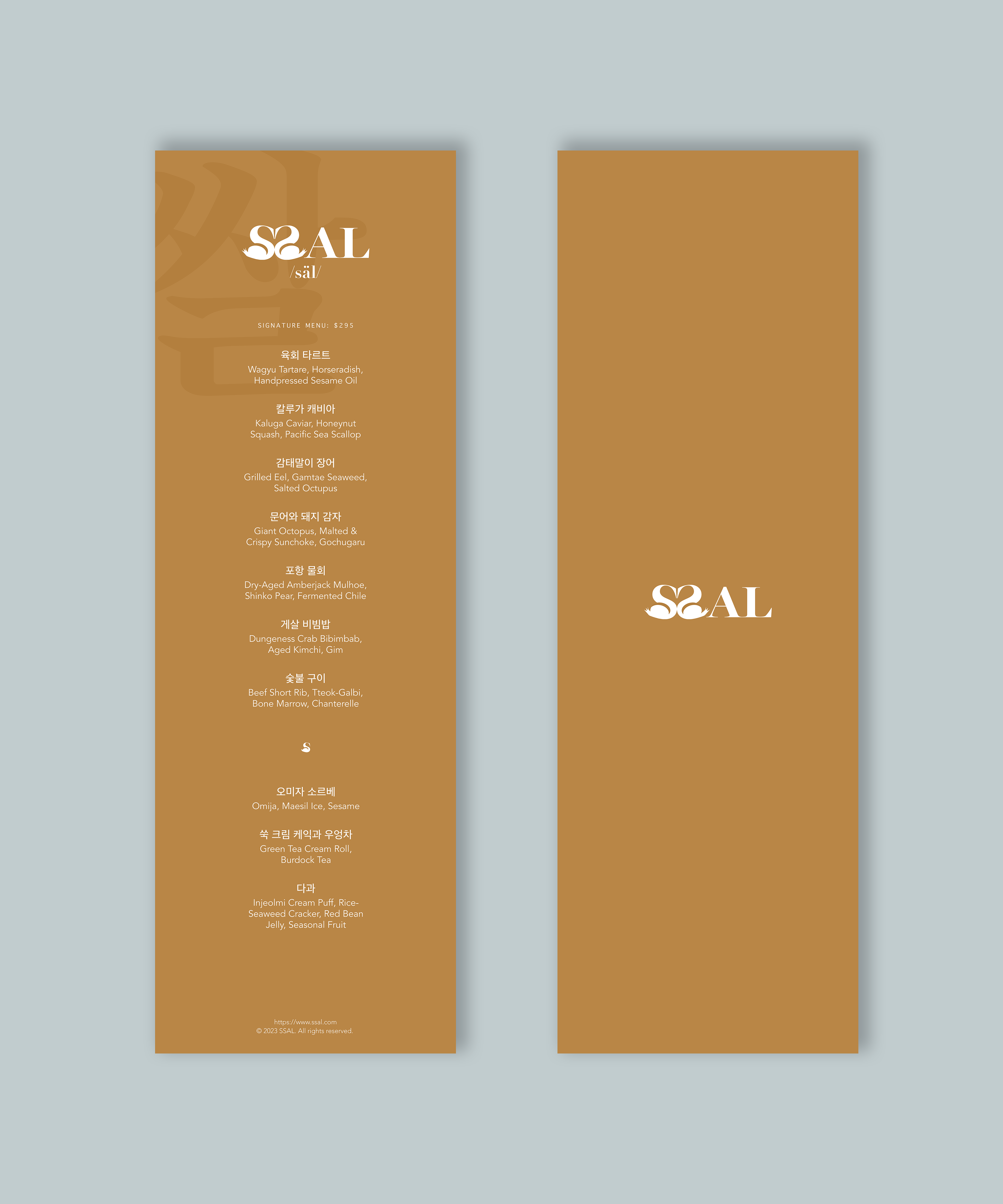
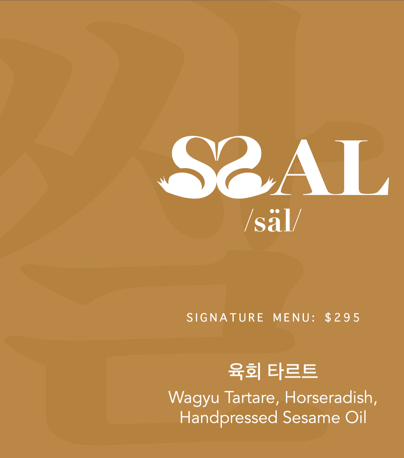
In this portfolio segment, I integrated the Korean word "쌀," which translates to "rice," into the background of the restaurant's name/logo. This addition creates a visually striking element and contributes a contemporary flair suitable for the ambiance of a fine dining establishment. Beneath the logo, I also incorporated a symbol pronounced as "SSAL." This design choice not only enhances the aesthetic appeal but also deepens the cultural connection of the brand.
#2 Design Highlight
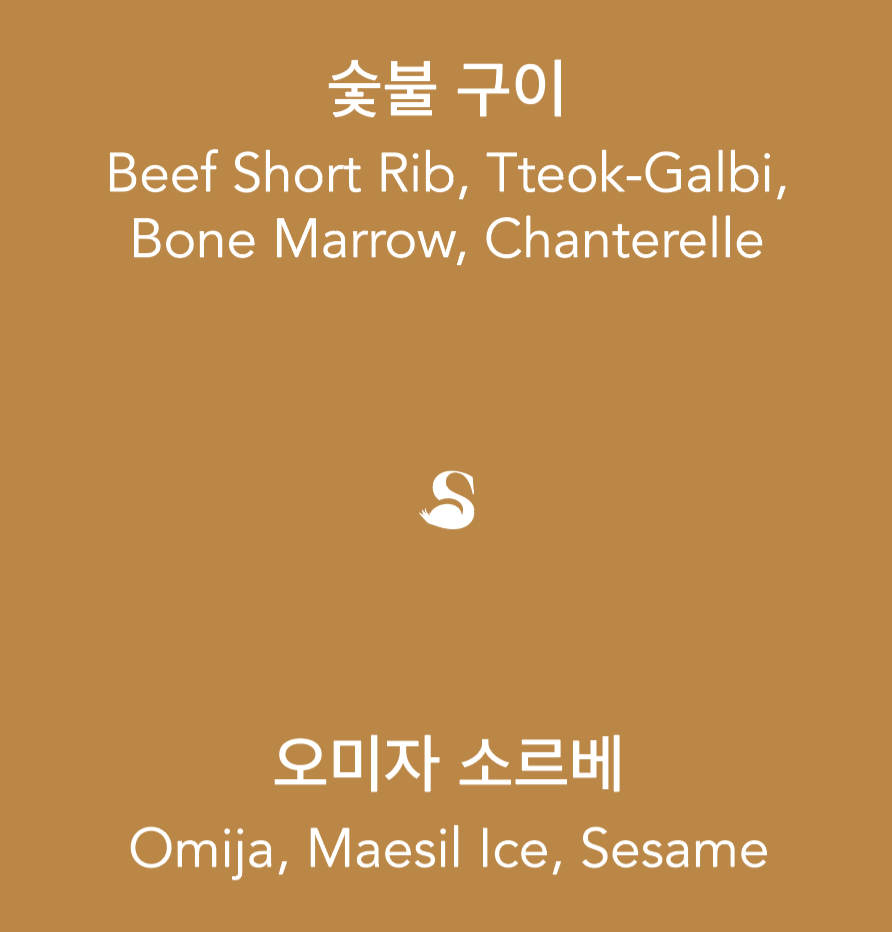
I incorporated a Mandarin duck illustration between the main course and dessert sections to subtly delineate these two distinct areas. This artistic touch quietly guides the viewer's eye through the transition, enhancing the overall dining experience.